


guptavikash7994@gmail.com
- December 17, 2025
- Digital Marketing
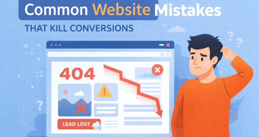
You’ve poured time, money, and energy into building a beautiful website. The design is sleek, the images are high-resolution, and you’re finally getting traffic. But there’s a problem: nobody is buying. Your visitors arrive, browse for a few seconds, and then vanish without a trace.
This scenario is frustratingly common. Often, the difference between a website that sells and one that stagnates isn’t about the product itself—it’s about the user experience. Subtle friction points can frustrate potential customers and send them running to your competitors.
In this post, we’re going to dissect the most common website mistakes that silently kill conversions. We won’t just point out the problems; we’ll give you actionable fixes to turn those bouncing visitors into loyal customers. For more tips on improving your website’s performance, explore Digitalasap’s full range of web design services.
This scenario is frustratingly common. Often, the difference between a website that sells and one that stagnates isn’t about the product itself—it’s about the user experience. Subtle friction points can frustrate potential customers and send them running to your competitors.
In this post, we’re going to dissect the most common website mistakes that silently kill conversions. We won’t just point out the problems; we’ll give you actionable fixes to turn those bouncing visitors into loyal customers.
The Need for Speed: Slow Loading Times
We live in an era of instant gratification. If your website takes longer than three seconds to load, you are already losing a significant chunk of your audience. Google research shows that as page load time goes from one second to three seconds, the probability of a bounce increases by 32%.
When a user clicks your link, they expect immediate results. A spinning wheel is a “stop” sign to a potential customer. It tells them your business is slow, outdated, or unreliable before they even see your content.
How to Fix It
Start by testing your site speed using free tools like Google PageSpeed Insights or GTmetrix. These tools will pinpoint exactly what is slowing you down.
- Optimize Your Images: Large, high-resolution images are the most common culprit. Compress them using tools like TinyPNG before uploading them.
- Use Browser Caching: This allows a visitor’s browser to store parts of your page so it loads faster on their next visit.
- Minimize Code: Remove unnecessary characters, spaces, and comments from your CSS and JavaScript files.
Ignoring the Mobile Experience
Look around you. Everyone is on their phone. If your website looks great on a desktop monitor but turns into a jumbled mess on a smartphone, you are neglecting more than half of your potential traffic.
Mobile optimization isn’t just about shrinking your desktop site to fit a smaller screen. It’s about touch targets, readable fonts, and simplified navigation. If a user has to “pinch and zoom” to read your text or accidentally clicks the wrong button because they are too close together, they will leave.
How to Fix It
Adopt a “mobile-first” mindset. When reviewing your website, check it on your phone before you check it on your computer.
- Responsive Design: Ensure your website theme or template automatically adjusts layout based on screen size.
- Thumb-Friendly Navigation: Make buttons large enough to be tapped easily with a thumb. Avoid tiny links buried in text.
- Simplify Forms: Typing on a phone is tedious. Keep mobile forms short and only ask for essential information.
The Mystery of the Unclear Call-to-Action (CTA)
Your visitors aren’t mind readers. They need you to tell them exactly what to do next. One of the biggest conversion killers is a lack of clear direction.
If a user lands on your homepage and has to hunt for a “Buy Now,” “Contact Us,” or “Sign Up” button, you’ve failed. Vague CTAs like “Learn More” or “Submit” are equally ineffective because they don’t convey value or urgency. Worse yet is having too many conflicting CTAs, which leads to analysis paralysis—the user does nothing because they are overwhelmed by choices.
How to Fix It
Be bold, clear, and direct. Your primary CTA should be the most visually distinct element on the page.
- Use Action Verbs: Instead of “Submit,” use “Get My Free Guide” or “Start My Trial.”
- Contrast is Key: Make your CTA button a color that stands out from the rest of your design. If your site is blue, make the button orange or green.
- One Goal Per Page: Decide on the single most important action you want a user to take on a specific page and focus everything around that.
A Lack of Trust Signals
Buying online requires a leap of faith. Users are handing over their credit card information or personal details to a stranger. If your website feels sketchy, impersonal, or abandoned, they won’t convert.
Trust signals are the digital equivalent of a clean storefront and a friendly handshake. Without them, skepticism wins. Common red flags include broken links, outdated copyright dates in the footer, lack of contact information, and zero social proof.
How to Fix It
Prove to your visitors that you are a legitimate, active, and trustworthy business.
- Showcase Social Proof: Display testimonials, reviews, and case studies prominently. Real faces and names carry more weight than anonymous quotes.
- Display Security Badges: If you are an e-commerce site, show icons for secure payment processing (like PayPal, Visa, or SSL certificates).
- Be Accessible: Include a physical address, a phone number, and a professional email address. Make it easy for people to reach a human.
Overcomplicated Navigation
Have you ever walked into a grocery store where the aisles made no sense? It’s frustrating, and you likely left without finding the milk. Your website navigation is the signage for your store.
If your menu is cluttered with too many options, jargon, or nested dropdowns that disappear when you try to click them, users will get lost. A confused mind doesn’t buy. They simply close the tab.
How to Fix It
Keep it simple. Your goal is to help the user find what they need in as few clicks as possible.
- Stick to Conventions: Don’t get creative with standard labels. “Contact” is better than “Let’s Parley.” Users look for familiar keywords.
- Limit Menu Items: Try to keep your main navigation menu to seven items or fewer.
- Include a Search Bar: For sites with a lot of content, a search bar is a safety net for users who can’t find what they need through browsing.
Burying the Value Proposition
When a visitor lands on your site, they ask one question: “What’s in it for me?” If you don’t answer that question within the first five seconds, you’ve lost them.
Many businesses make the mistake of talking exclusively about themselves—their history, their awards, their office culture. While that’s nice, it doesn’t solve the customer’s problem. If your headline is “Welcome to Our Website” instead of a statement about how you help the user, you are killing conversions.
How to Fix It
Flip the script. Focus on benefits, not just features.
- Clear Headlines: Your main headline should state exactly what you offer.
- Subheadlines: Use a subheadline to explain how it solves a pain point.
- Speak to the User: Use “You” more than “We.” Instead of “We sell high-quality vacuums,” try “Keep your home spotless with half the effort.”
Turning Browsers into Buyers
Fixing these website mistakes doesn’t require a total rebrand or a massive budget. It requires empathy for your user. By looking at your website through the eyes of a potential customer, you can spot the friction points that are holding you back.
Start small. Check your site speed today. Review your mobile layout tomorrow. Rewrite one vague CTA next week. These incremental changes compound over time, transforming your website from a passive brochure into a conversion engine. Your traffic is already there; now it’s time to make it count.
What is the most common mistake that businesses overlook?
Slow loading times are often underestimated. Even small delays can drive visitors away, impacting conversions significantly.
How can I quickly check if my website has conversion-killing mistakes?
Start by reviewing your site using tools like Google PageSpeed Insights for speed, Mobile-Friendly Test, and assess your CTAs, navigation, and visible trust signals. Internal audits and user feedback are also valuable.
How important are trust signals for a website?
They are critical. Without trust signals such as customer reviews, secure payment badges, and clear contact information, users are less likely to make a purchase or provide personal details.
Should every page have a call-to-action?
Yes, but it should be relevant to the page’s goal. Make sure every page guides the visitor toward the next step you want them to take.
Can Digitalasap help fix these website mistakes?
Absolutely! Visit our Conversion Rate Optimization page to discover how our team can assess and enhance your website for better results.
What is Digitalasap?
Digitalasap is a full-service digital marketing agency based in India, specializing in data-driven strategies to help businesses grow online. They focus on providing measurable results through innovative web solutions, creative content, and personalized digital campaigns. Learn more about Digitalasap.
What services does Digitalasap offer?
Digitalasap offers a comprehensive range of services, including:
- Website Design & Development
- SEO & Search Marketing
- Social Media Marketing
- Performance Marketing
- Conversion Rate Optimization
- Content Marketing & Branding
Explore their full list of offerings on the services page.
Why choose Digitalasap for your website and marketing needs?
With experienced professionals, proven strategies, and a passion for delivering growth, Digitalasap combines creativity with technology to achieve your business objectives. Their dedicated support and transparent process ensure you get the most value from your investment. Visit their client testimonials page for real stories from satisfied partners.


7 replies on “Common Website Mistakes That Kill Conversions”
bet999bet
Okay, let’s get serious. Trying out bet999bet tonight. Heard some good things, hoping it lives up to the hype. Wish me luck! You can join the fun too: bet999bet.
777kingcom
777kingcom is the real deal! I’ve been playing here for a while, and I’ve actually won some money! The site is reliable, and the customer service is pretty good too. Give 777kingcom a shot!
m333
M333… hmm. Gave it a whirl, I’d say it’s alright. The site’s pretty easy to navigate, which is a plus. They could offer some more live dealer options, that’d be nice. Give m333 a try if you’re looking for something new.
serptechsol
Avoiding slow loads, poor navigation, and weak CTAs prevents conversion kills; focus on user-centric fixes. SERP Technology Solutions provides digital marketing services to optimize conversions.
jk4casino
JK4casino, hmm. Seems like a solid platform. I keep seeing it pop up. I should maybe give it a try one of these days. Who wants to come play? jk4casino.
tt128bet
Checking in from tt128bet! A fairly solid choice for your betting needs. Not the flashiest site, but it does the job. Wide variety of games, quick load times. See them around tho: tt128bet
Top 10 WordPress SEO Mistakes to Avoid in 2026
[…] Common Website Mistakes That Kill Conversions — Highlights frequent missteps, including missed opportunities for internal linking. […]